Lead Capture Landing Page Guide That Converts in 2026
Build a high-converting lead capture landing page in 2026. Practical guide covering copy, forms, CTAs, A/B testing, and AI chat capture with SupportGPT.
You've launched the campaign, the ads are getting clicks, and the analytics dashboard looks healthy until you check the actual lead count. Visitors arrive, skim the headline, hesitate at the form, and disappear. The page isn't necessarily broken. More often, each element is doing a reasonable job in isolation while the complete journey asks for too much trust, effort, or commitment too early.
A lead capture landing page works when it connects the entire loop: the ad promise, the page architecture, the offer, the form, the conversation after hesitation, and the CRM action that follows submission. Conversion rate matters, but it isn't the only outcome. A page that generates more contacts while sending sales poorly matched names can create just as much operational waste as a page with weak conversion.
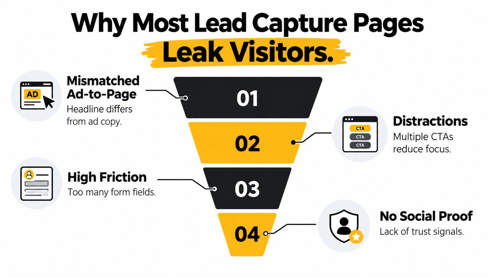
Why Most Lead Capture Landing Pages Leak Visitors
A paid acquisition manager can spend thousands on traffic and still watch the form fill rate stall because the page answers the wrong question. The ad says “Get the pricing template,” but the landing page opens with “Transform your revenue operations.” The visitor has to decode the connection, and most won't spend the effort.
The first leak is intent mismatch. Search traffic, an email click, a retargeting visitor, and a product-led referral arrive with different expectations. A single generic page forces all of them through the same argument. The second leak is headline-subhead dissonance. A broad headline paired with a narrow offer leaves visitors unsure whether the page is meant for them.
Four leaks worth diagnosing first
- Mismatched traffic and message: Mirror the campaign's central promise in the first visible headline. Don't make visitors reconcile two different versions of the offer.
- Competing actions: Navigation, secondary buttons, and unrelated content give visitors escape routes. A focused page should make the primary next step obvious.
- Timid calls to action: “Submit” describes your internal process, not the value the visitor receives. The button should name the outcome or asset.
- Premature form friction: Asking for a company profile, budget, role, phone number, and use case before showing proof turns curiosity into a commitment decision.
The issue isn't that every long page or multi-field form is automatically wrong. A high-intent demo page can justify more qualification than an email-only checklist. The failure occurs when the page's demands don't match the visitor's awareness or the value of the offer.
Benchmark context helps set a sensible starting point. A major Unbounce benchmark analyzed more than 57 million conversions, 41,000 landing pages, and 464 million visitors, finding a 6.6% median conversion rate across industries. Email traffic converted at 19.3% on average, while mobile represented 82.9% of visits and desktop converted at 12.1% compared with 11.2% for mobile. These figures are reported in the Unbounce landing page benchmark summary, and they reinforce a practical point: traffic quality, device mix, and copy complexity change the result.
Practical rule: Diagnose the page according to the visitor's intent, not according to the design team's preferences.
I also recommend comparing the page against a detailed Sprints & Sneakers landing page guide before rebuilding it. The useful question isn't “Does this look polished?” It's “Does every visible element help this visitor understand, trust, and complete one specific exchange?” That same journey logic should continue into the customer journey mapping framework, where the lead's next step is defined before the form is published.
Designing a Page Architecture That Guides the Eye
A strong page architecture turns a sequence of psychological decisions into a visible path. The visitor should be able to answer four questions without hunting through the page:
- Is this for me?
- Can I trust it?
- What exactly will I receive?
- What happens when I click?
Start with the hero decision
The hero zone resolves relevance. Match the ad's language closely enough that the visitor immediately recognizes the promised offer. The headline should name the buyer and outcome, while the subhead explains what they'll get, not merely what your product is.
Weak: “Powerful CRM automation for modern teams.”
Stronger: “Ship proposals faster without leaving your CRM.”
The second version gives the visitor a result and a context. A product name or feature list can appear below, after relevance is established.
Let proof answer the trust question
Place proof where doubt naturally appears. A restrained proof block can contain customer logos, one verifiable business outcome, and a short testimonial that identifies the user's role or situation. Don't bury all credibility at the bottom, and don't fill the hero with a wall of badges that competes with the offer.
The form position depends on intent. Paid visitors who clicked a specific offer may need the form immediately. Visitors arriving from broad educational content may need a longer explanation, examples, or objections answered first. A long page can place the form below the fold if the preceding content earns the exchange.

Repeat the offer, not the mechanics
A CTA stack should reinforce the asset or outcome. “Get the pricing template” is clearer than “Submit.” “Send me the audit” is more concrete than “Learn more.” Repeat the same offer at natural decision points, but don't introduce a competing action halfway down the page.
On mobile, collapse the layout into one column. Keep the form inputs wide, the proof legible, and the main CTA within comfortable thumb reach after the visitor has understood the offer. A sticky button can help on a long page, but it must not cover form fields, consent language, or important product information. The interaction pattern should follow the guidance in this practical overview of chat UI design, especially when conversational capture shares space with a conventional form.
A useful layout sketch looks like this:
- Hero: matched headline, outcome-led subhead, primary CTA.
- Proof: logos, one substantiated result, short testimonial.
- Offer detail: what the visitor receives and who it suits.
- Form: only the information required for the next action.
- Objection handling: privacy, delivery timing, compatibility, or pricing expectations.
- Final CTA: the same offer language, with no new decision.
Writing Copy and CTAs That Earn the Click
Copy improves when you rewrite it in passes instead of trying to produce a perfect headline in one attempt. Start with the buyer, add the result, then remove language that only sounds impressive internally.
Consider this starting point: “The Best CRM for Modern Teams.” It makes a broad claim, identifies no specific problem, and gives the visitor no reason to act now. The first rewrite names the audience: “CRM automation for SaaS revenue teams.” The second adds the outcome: “Help SaaS revenue teams ship proposals faster.” The final version cuts the filler and sharpens the promise: “Ship proposals faster without leaving your CRM.”
The subhead should preview the exchange. “A flexible platform with powerful workflow features” describes the product from the company's perspective. “Get the workflow template, setup checklist, and examples you need to automate your next proposal process” describes what the lead receives.
| Element | Weak Version | Strong Version | Why It Works |
|---|---|---|---|
| Headline | The Best CRM for Modern Teams | Ship proposals faster without leaving your CRM | Names a practical outcome and a relevant context |
| Subhead | Powerful tools for growing businesses | Get the workflow template and setup checklist for your next proposal process | Makes the deliverable tangible |
| Primary CTA | Submit | Send me the checklist | Signals what happens after the click |
| Secondary CTA | Learn More | See how the workflow works | Reduces ambiguity and sets an expectation |
| Form prompt | Enter your information | Get the template in your inbox | Connects the input to the reward |
Make every line carry one job
Use active verbs, second-person language, and one idea per line. Replace internal terms such as “revenue enablement infrastructure” with the customer's actual task, such as “give sales one place to find the latest proposal.” If a claim needs qualification, qualify it near the claim rather than hiding the explanation in fine print.
“Start my free trial” works for a product trial because it describes the commitment. “Get my audit” works for a diagnostic offer because the visitor can picture the deliverable. “Book a demo” is appropriate when a sales conversation is genuinely the next step, but it's a poor CTA for a low-intent guide.
Your lead magnet also determines the copy style. A template needs specificity and an immediate-use promise. A webinar needs a clear learning outcome and attendance expectations. An ecommerce incentive needs transparent delivery terms. Use the relevant lead magnet examples as a prompt to match the page promise to the asset, not as a reason to copy another brand's wording.
Read the finished page aloud. Awkward phrases, stacked qualifiers, and unexplained acronyms become obvious when spoken. If the headline sounds like a board presentation rather than something a buyer would repeat to a colleague, rewrite it.
Right-Sizing Your Form Without Killing Conversion
Every field creates a trade-off. More information can help sales qualify and route a lead, but the visitor experiences each question as additional effort and scrutiny. The right form is not the shortest form in every situation. It's the shortest form that supports the next operational decision.
Benchmark summaries report a clear relationship between field count and conversion. Single-field forms average 13.4%, three-field forms 10.1%, five-field forms 7.8%, seven-field forms 5.3%, and nine-field forms 3.6%, based on the lead capture form benchmark data. Treat these as directional benchmarks, not a promise for your audience. Offer type, traffic source, brand trust, and qualification requirements still matter.
| Number of Fields | Avg Conversion Rate | Best For | Example |
|---|---|---|---|
| 1 | 13.4% | Low-friction awareness offers | Email delivery for a checklist |
| 3 | 10.1% | Standard resource capture | Name, email, and role |
| 5 | 7.8% | More contextual qualification | Name, email, company, role, use case |
| 7 | 5.3% | Higher-intent sales workflows | Demo request with qualification details |
| 9 | 3.6% | Complex routing or regulated processes | Detailed consultation intake |
Ask only what changes the next action
For a top-of-funnel guide, email may be enough. For a product demo, name, email, and company can support routing without turning the page into an application. Ask for a field when you can explain what decision it enables. If the CRM or sales team won't use the answer, remove it.
A useful decision rule is: ask only what you can't reasonably infer, and enrich the rest downstream. Firmographic tools such as Clearbit or ZoomInfo may help teams append company information, but enrichment should respect consent, accuracy, and the purpose for which the data was collected. A chatbot or booked-call flow can collect deeper context after the visitor has received value.
Progressive profiling is often the better compromise. A returning visitor can see a different question after the initial email capture, while a first-time visitor sees the minimum viable form. Smart defaults, clear labels, inline validation, and a visible delivery expectation reduce perceived effort without hiding what the visitor is agreeing to.
The quality question matters as much as the volume question. A page that maximizes raw signups can burden sales with irrelevant contacts. Industry medians in public benchmark coverage range from 3.8% to 12.3%, with top pages reaching 11.45% or higher and the bottom quartile falling below 3%, as summarized in this lead capture page benchmark analysis. Use those ranges to frame testing, then judge the page by qualified leads and downstream pipeline, not form completions alone.
Wiring AI Chat Capture and CRM Routing with SupportGPT
A conversational layer helps when visitors need an answer before they're willing to share contact details. It should not replace clear page copy or turn a simple email exchange into an interrogation. The useful design is hybrid: the page establishes value, the assistant handles uncertainty, and the CRM receives structured data.
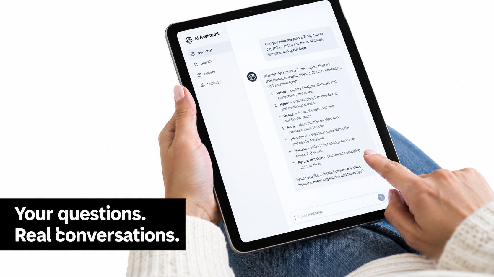
Start with an opening prompt that qualifies intent without sounding like a form. “What are you trying to improve?” gives the visitor a useful first move. Based on the response, the flow can ask about use case, company size, timeline, or the specific asset they want. If the visitor asks a product question, answer it and continue the flow only after the question has been resolved.
Configure the conversation around decisions
Define the capture fields before writing the dialogue. Typical fields include:
- Contact details: Name and email, with phone requested only when a phone follow-up is necessary.
- Intent: Resource request, product evaluation, support question, or sales conversation.
- Qualification: Use case, timeline, company context, and relevant product requirements.
- Consent: A clear explanation of follow-up communications and links to the applicable privacy information.
Then define routing rules. An enterprise request can route to an account executive, while a self-serve question can enter a nurture sequence. The rule should use explicit signals, not vague assumptions. Attach the source, campaign, landing page variant, and conversation transcript when the connector or webhook sends the record to HubSpot, Salesforce, or Pipedrive.
The fallback path matters more than the clever opening. If the assistant can't answer, it should offer the standard form, a human contact option, or a resource that addresses the question. Never trap a visitor inside a conversational flow that cannot resolve intent. The implementation principles in this guide to integrating AI on a website are useful here because the assistant remains part of the page experience rather than becoming an isolated support destination.
Mobile deserves separate review. AI trend coverage describes personalization by traffic source, device, geography, time of day, and prior behavior, alongside conversational capture through chatbots and quizzes. The same source reports that pages loading in under 3 seconds can convert 32% better than slower pages, while personalized landing pages can improve conversions by up to 202%, so those claims should be treated as source-specific benchmarks rather than universal outcomes. See the 2026 landing page trend coverage for that context.
The final test is operational. Submit a test conversation, confirm consent storage, verify field mapping, inspect the CRM owner, and check that the transcript carries enough context for a human to act without asking the visitor to repeat everything.
A/B Testing and Conversion Tracking That Actually Inform Decisions
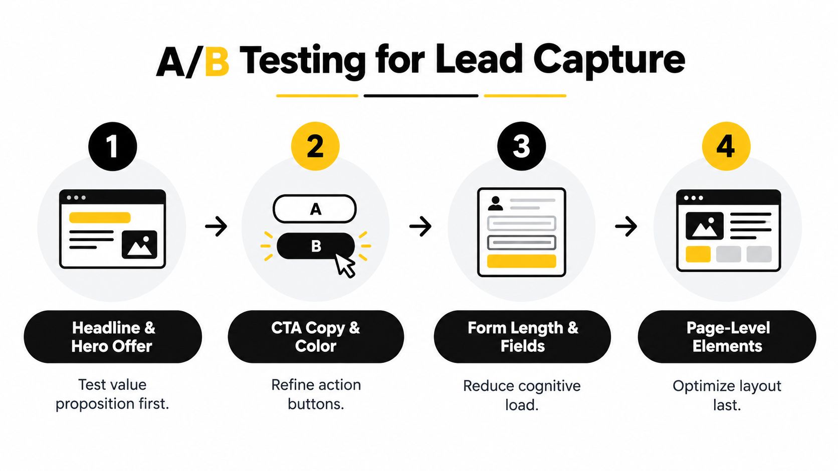
Most landing page tests produce weak conclusions because teams change several variables together or stop when an attractive result appears. A disciplined sequence isolates the biggest source of uncertainty first. Start with the offer and hero message, then move toward interaction details and supporting proof.
Test the largest decision first
A practical order is:
- Headline and hero offer: Test whether the visitor understands the value and audience fit.
- CTA language and treatment: Compare outcome-specific wording and button presentation.
- Form length and field order: Remove unnecessary questions or move sensitive questions later.
- Proof and page-level elements: Test testimonial placement, logos, objections, and layout.
Don't test button color while the page still has a vague offer. A small visual change can't compensate for a visitor who doesn't understand what they receive. Likewise, don't rebuild the entire page when the tracking setup can't distinguish a form focus from a successful CRM handoff.
Use a predeclared decision threshold for each experiment, based on the lift that would justify implementation. If the expected improvement is too small to matter commercially, don't spend weeks chasing statistical noise. Run the test through representative business cycles and account for campaign changes, audience mix, and device distribution.
Track the complete lead path
At minimum, capture these events:
- page_view: The visitor arrived on the intended page.
- form_focus: The visitor began interacting with the form.
- form_submit: The form accepted the submission.
- qualified_lead: Sales or the qualification workflow marked the contact as relevant.
- matched_crm_id: The lead record was successfully connected to the CRM.
Persist utm_source, utm_medium, utm_campaign, and utm_content from the first visit through the CRM record. Store the page variant and conversational path as well, otherwise a later qualified lead may be impossible to connect to the experience that produced it.
Review test results on a fixed schedule rather than reacting to every daily fluctuation. Compare conversion with qualification, response time, routing accuracy, and eventual opportunity progression. A page that loses a small amount of volume but produces substantially more useful conversations may be the better growth asset.
For ongoing iteration, use a documented continuous optimization process. Record the hypothesis, audience, primary metric, guardrail metric, launch date, and decision. That record prevents the team from retesting the same idea under a different name.
Troubleshooting, Optimization Cadence, and Final Checklist
The fastest way to improve a lead capture landing page is to identify where the visitor stops and ship the smallest fix that addresses that behavior. Don't begin with a redesign when the evidence points to a routing failure or a broken mobile field.
Five common leaks and first fixes
- Low hero engagement: A weak click-through or shallow scroll suggests the offer isn't clear enough. Rewrite the headline to match the source campaign and make the outcome visible immediately.
- Form abandonment: High form focus with low submission indicates friction, uncertainty, or a validation problem. Remove a nonessential field, clarify the delivery promise, and test the form on real devices.
- Misrouted leads: Qualified contacts reaching the wrong owner usually indicate incomplete routing logic or inconsistent field values. Normalize options and test each routing branch with sample submissions.
- Slow page experience: Delayed rendering, oversized media, and late-loading scripts can interrupt intent. Compress assets, defer nonessential scripts, and test the page on mobile connections.
- Tracking gaps: A gap between form submissions and CRM records makes optimization guesswork. Compare browser events, server responses, deduplication rules, and CRM IDs before trusting the dashboard.
Use a cadence the team can maintain
During the first month, run small weekly tests on headlines, subheads, CTA wording, and objection handling. Review form completion and routing every two weeks, including the quality of recent leads with sales. After enough behavioral evidence accumulates, rebuild the architecture quarterly when heatmaps, recordings, campaign changes, or product positioning show that the original path no longer fits.
The volume-versus-quality decision belongs in every review. Ask whether the page is attracting the intended audience, whether the assistant or form captures useful context, and whether sales can act on the record without manual reconstruction. Conversion rate is a diagnostic signal, not the final business outcome.
Pre-launch checklist
- Message match: The ad, email, search result, and landing page share the same core promise.
- Mobile rendering: Headlines, fields, proof, consent text, and buttons remain usable on a narrow screen.
- Page speed: Images and scripts are optimized before traffic arrives.
- Form validation: Required fields, error states, keyboard behavior, and confirmation messages work as intended.
- CRM mapping: Every captured field maps to the correct destination and owner.
- Consent language: The visitor understands what data is collected and how follow-up works.
- Routing rules: Enterprise, self-serve, support, and uncertain intents each have a defined path.
- Assistant fallback: Visitors can reach a standard form or human option when conversational qualification fails.
- Attribution: Campaign parameters survive from the landing page into the lead record.
- Post-submit experience: The promised asset, confirmation, nurture step, or booking action appears immediately.
SupportGPT can add a conversational capture layer to your landing page, collect contact details and qualification context, and route the resulting lead or transcript into the workflow your team already uses. Visit SupportGPT to see how an AI assistant can support a clearer, more qualified lead capture journey.