Mastering Modern Chat UI Design
Discover the essential principles of modern chat UI design. Learn to create intuitive, AI-powered conversational interfaces that engage and convert users.

The design of your chat UI is more than just aesthetics; it's the very foundation of how users will experience and interact with your AI support agent. A truly effective chat UI is a delicate balance of clarity, speed, and trust, all woven into a conversation that feels effortless.
Foundations Of Engaging Chat UI Design

Crafting a great conversational flow requires a completely different approach than building a standard, button-driven application. It's about getting ahead of user needs and dropping in helpful cues exactly when they're needed.
Here in India, user expectations for chat are set incredibly high by platforms like WhatsApp and Telegram. People are used to lightning-fast, intuitive interfaces, and anything less feels clunky. Hundreds of millions of users have been conditioned by these apps, so our design choices need to reflect that reality. For a deeper dive into these trends, Meltwater offers some great insights into social media usage in India.
To meet these expectations, we need to focus on a few core ideas:
- Clarity: Messages must be incredibly simple to read and understand at a glance.
- Efficiency: Every tap counts. The goal is to get the user an answer with the least amount of effort and waiting.
- Trust: Simple things like status indicators and confirmations go a long way in building a user's confidence in the AI.
Core Principles Of Effective Chat UI
To help bring these concepts to life, it's useful to think about them in a more structured way. This table breaks down each core principle and shows how it translates into a real design decision.
Core Principles of Effective Chat UI Design
| Principle | Why It Matters | Practical Application Example |
|---|---|---|
| Clarity | Improves readability and speeds up comprehension, reducing user frustration. | Instead of just "Yes," label a quick reply button with the full action, like "Yes, book my flight." |
| Efficiency | Reduces the time and mental energy a user has to spend to get their task done. | Use typing indicators to show the AI is working, but don't let them run for too long and cause anxiety. |
| Trust | Fosters confidence that the AI understands the user and is handling their request correctly. | Instantly show a confirmation tick or a "Got it!" message after the user makes a selection. |
Thinking through this table can spark some really practical ideas for your own chat UI, making sure every element you add has a clear purpose.
Managing Conversational Context
Nothing is more frustrating for a user than having to repeat themselves. A smart chat UI remembers the conversation's context, making the entire interaction feel more intelligent and personal.
- For complex tasks like filling out a form, use threading or visually group related messages together.
- A great trick is to summarise what the user has already told you, like "Okay, a flight to Mumbai on Tuesday. Got it. How many passengers?"
- For the technical side, store critical variables (like a user ID or order number) in hidden payloads so the AI can recall them later if needed.
A key takeaway here is to always reflect the user's last input. This simple act confirms you've understood them and smoothly guides them to the next step.
Using Progressive Disclosure
Bombarding a user with too many options right at the start is a guaranteed way to kill the conversation's momentum. Progressive disclosure is the art of revealing information and options only when they become relevant.
- Start with simple quick replies for the most common actions.
- If you need to collect a lot of information, tuck complex forms behind an expandable "Add Details" button.
- Think about using contextual menus that appear based on the user's last message, rather than a cluttered, persistent toolbar.
Building Effective Feedback Loops
Good feedback loops are all about keeping the user in the loop and making them feel in control. The UI should acknowledge every single input, big or small.
- The moment the AI starts processing a request, pop up a typing indicator.
- Provide instant success or error messages. Don't leave the user guessing if their action worked.
- Behind the scenes, log these interactions. This is invaluable for troubleshooting and helping a user recover if something goes wrong.
Crafting a Human-Like Conversation Flow
Your AI doesn't need to pass the Turing test, but its responses should feel natural, not robotic. This is achieved by mirroring the subtle patterns of human chat.
- Add a tiny, almost unnoticeable delay before the AI responds. Instant answers can feel jarring.
- Build a library of varied phrases. Instead of always saying "Okay," mix in "Got it," "Sure thing," or "No problem."
- If a user expresses frustration, acknowledge it with simple, empathetic phrases.
Example Scenario
Let's imagine a user trying to book a train ticket. A well-designed UI would guide them through it step-by-step.
- It starts by asking for just one thing: the journey date. This reduces the initial mental load.
- Only after the date is selected does it show the available seat classes (Sleeper, 3AC, etc.).
- It confirms each choice with a quick summary before finally prompting for payment.
Measuring Success
You can't improve what you don't measure. Keep a close eye on a few key metrics to understand how well your UI is performing. A/B testing different button text or message phrasing can lead to some surprising improvements.
- Completion Rates: Are users successfully finishing their tasks?
- Conversation Length: Shorter isn't always better, but unusually long conversations can signal a point of friction.
- Error & Bounce Rates: Where are users getting stuck or giving up?
- User Satisfaction Scores (CSAT/NPS): Directly ask users for their feedback.
Your Next Steps
Ready to get started? Begin by mapping out the most critical conversation paths for your users. Sketch some quick wireframes and, most importantly, get them in front of real people for testing as soon as possible.
- Draft your key user scenarios before you write a single line of code.
- Use simple prototyping tools to test the flow without getting bogged down in visual design.
- Listen to user feedback and be ready to iterate.
- Don't forget to test how the UI performs on slow or unreliable network connections.
By following these principles, you'll be well on your way to designing a chat UI that not only works well but also delights your users, driving real engagement.
A Quick Reminder on Accessibility
Always design for everyone. This means considering users with different literacy levels, device constraints, and abilities.
- Use clean, readable fonts with good spacing.
- Ensure your colour palette has high contrast.
- Add ARIA labels to interactive elements to support screen readers and other assistive technologies.
The Anatomy of a High-Performing Chat Interface
A great chat UI isn't just a stream of text bubbles. It’s a carefully assembled toolkit, where each component has a specific job in making the conversation feel smooth and natural. When we move beyond the basics, we can see how these different elements come together to create an experience that genuinely helps the user, reducing their effort at every turn.
The trick isn't to cram in as many features as possible. It's about deploying the right component at precisely the right moment. A well-placed button or a subtle typing indicator can be the difference between a clunky, frustrating exchange and one that feels surprisingly helpful.
The Core Building Blocks: Message Bubbles
Message bubbles are the heart and soul of any chat screen. Their design has a massive impact on readability and the overall tone of the conversation. I always tell my team to obsess over the details here—things like colour contrast, typography, and spacing—to make sure messages are effortless to scan.
A simple but highly effective trick is using distinct background colours for the user's messages versus the AI's responses. This creates an instant visual distinction. Another pro-tip is to group messages sent in quick succession. This cleans up the chat log, preventing it from feeling cluttered and overwhelming for the user.
Guiding the Conversation with Quick Replies
Quick replies are easily one of the most powerful tools in our arsenal. These are the tappable suggestions you see at the bottom of the screen, designed to nudge the user towards a specific action or answer. From a user's perspective, tapping a button is always easier than typing.
Don't just use generic options like "Yes" or "No." A good quick reply provides context. Instead of "Yes," try something like, "Yes, show me blue shirts." This confirms what the user is agreeing to and gives the AI a crystal-clear command to work with.
Here’s a crucial piece of advice I've learned from experience: always make quick replies disappear once one is tapped. This keeps the conversation history clean and stops users from accidentally tapping an old, now irrelevant option later in the flow.
Expanding Capabilities with Interactive Elements
To handle more complex tasks without booting the user out of the chat, we need to think beyond simple text. Modern chat UIs blend in a rich set of interactive components that make the conversation feel more like a mini-app.
- Buttons: Unlike quick replies, buttons can be placed inside a message bubble and they stick around. They’re perfect for key actions like "View My Order" or "Track Shipment."
- Carousels: Got a list of products, articles, or booking slots to show? Carousels are your best friend. They let users swipe horizontally through a collection of cards, each with its own image, title, and action buttons.
- In-Chat Forms: For gathering structured information like a delivery address or feedback, embedding a simple form right in the chat is a far better experience than sending someone to a different webpage. Just remember to keep these forms short and focused on one single task.
Used correctly, these elements transform a simple text exchange into a truly dynamic and useful tool.
Signalling Activity with Typing Indicators
That small animation of three bouncing dots—the typing indicator—is a tiny component that does a huge job. It provides instant feedback, telling the user, "I got your message and I'm working on a reply."
This little detail manages expectations perfectly and stops the user from wondering if the bot has crashed or the connection has dropped. But timing is absolutely everything. If that indicator hangs around for more than a few seconds, it can create anxiety, making the AI feel slow. I've found the sweet spot is to show it for just 1-3 seconds, which closely mimics a natural human typing rhythm.
Handling Different Message Types
A truly useful chat UI has to handle more than just plain text. Giving users the ability to send and receive different types of media makes the conversation far more engaging and functional.
Here’s a quick breakdown of common formats I've seen work well:
| Message Type | Best Use Case | Pro Tip |
|---|---|---|
| Images & GIFs | Visual confirmation (like a picture of a product), adding a touch of personality, or for troubleshooting steps. | Always ensure images are compressed for fast loading, especially for users on mobile networks in India. |
| Videos | How-to guides, product demos, or detailed explanations where text just won't cut it. | Use a clear thumbnail image and give users the option to play the video inline to keep them in the chat. |
| File Uploads | Letting users share documents like invoices, screenshots of an error, or logs for technical support. | Be upfront about accepted file formats and size limits to avoid frustrating upload failures. |
By thoughtfully incorporating these components, you can build a chat UI that feels both powerful and completely intuitive. The real skill is in choosing the right element for each moment in the conversation, always putting the user's need for clarity and speed first.
Designing for AI-Powered Conversations
Bringing an AI agent into your chat UI is a whole different ball game than just plugging in a simple chatbot. We're moving beyond canned responses and designing an interface that can truly collaborate with a user. The real challenge? Making the AI's intelligence feel both visible and trustworthy.
This means we have to get clever about designing for context, planning for when things go wrong, and giving the AI clear ways to take action for the user. It’s a design discipline where anticipating the user’s next thought is just as critical as the pixels on the screen.
Maintaining Conversational Context
A conversation with an AI falls apart the second a user has to repeat themselves. It’s frustrating and immediately breaks the illusion of intelligence. That's why visually reinforcing context is non-negotiable; it’s how you build trust and show the user the AI is actually listening.
Even simple visual tricks can make a world of difference. For instance, when an AI asks for clarification, it could quote the specific part of the user's last message it’s referring to. This tiny cue instantly confirms the AI understood the request and is just zeroing in on a detail, rather than being completely lost.
Another great pattern is the summary message. After gathering a few details, the AI can pop up a message like, "Okay, just to confirm: that's a one-way flight for two adults to Mumbai on 24 August. Is that right?" This gives the user a chance to review everything before committing, which makes the whole interaction feel much more controlled and secure.
This decision tree shows how to select the right UI element based on the immediate conversational need, guiding the user efficiently.
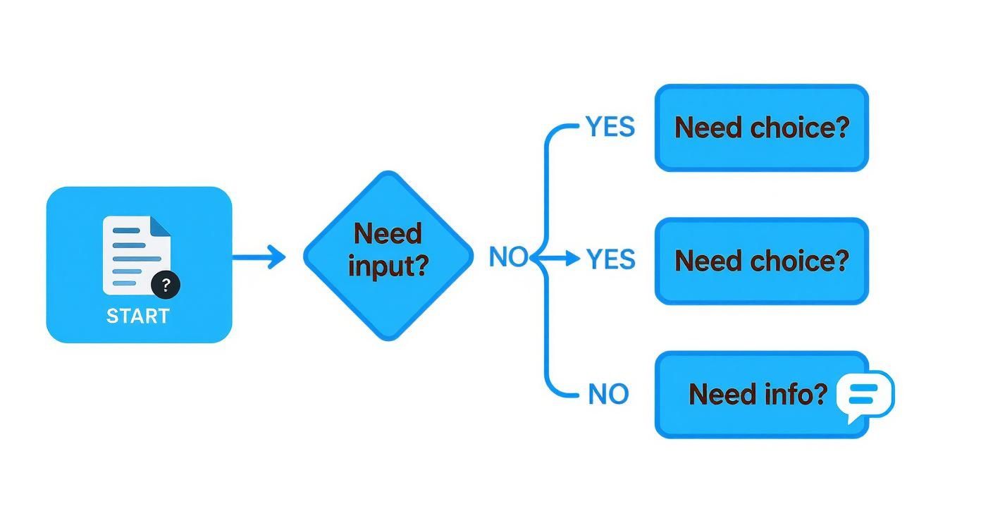
The flow demonstrates a core principle of conversational design which is to offer the simplest interaction method—a button for choice, a form for input—to reduce user effort at every step.
Designing Graceful Failure and Guardrails
Let’s be honest: even the smartest AI will eventually get confused or hit a dead end. How your chat ui design handles these inevitable stumbles is what separates a great experience from a rage-quit. The goal isn’t to prevent failure, but to fail gracefully.
Instead of a blunt "I don't understand," a well-designed failure state offers a way out. Imagine a user types "track my stuff." A weak AI gives up. A smart one offers quick-reply buttons like "Track an Order," "Find a Store," or "View Recent Purchases," guiding them back to a productive path.
A key insight is to treat failure as a design opportunity. It's a chance to guide the user back on track, not a dead end. Always provide an "out" so the user never feels stuck in a loop with the AI.
This is also where guardrails are essential. These are just proactive UI cues that keep the conversation on track. Think of placeholder text in the input field that says, "Try asking 'What's my order status?'" It gently nudges the user toward things the AI is actually good at.
Creating a Seamless Escalation to a Human
No AI can solve everything. At some point, a user will need a person. Designing a smooth, low-friction handoff to a human agent is one of the most critical parts of the experience. The user should never, ever feel trapped talking to a bot.
The transition has to be seamless and contextual. When the AI decides to escalate, it must pass the entire chat history to the human agent so the user doesn't have to start from scratch. A simple message in the UI can set expectations perfectly: "I'm connecting you with a support specialist who can help with this. They'll see our conversation so far."
This handoff can be triggered in a couple of ways:
- Explicitly: The user clicks a "Talk to a human" button that should always be accessible.
- Implicitly: The AI detects signs of frustration—like the user rephrasing the same question three times—and proactively offers to find a person.
The rise of AI and chatbots has really shaken up chat UI design in India, driving huge leaps in customer experience. We've seen e-commerce platforms using well-designed conversational UX achieve engagement rates up to 10 times higher than before. This has spurred a massive number of Indian businesses to prioritise chatbot implementation, even adapting natural language processing for local languages to create far more authentic interactions.
UI Patterns for AI-Driven Actions
The most valuable AI agents don't just talk; they do things. They can book appointments, process returns, or update account details right in the chat. Getting these actions right requires specific UI patterns that build trust and leave no room for error.
For a more integrated experience, platforms like SupportGPT offer complete solutions for building AI agents that can reliably perform these kinds of complex tasks.
Here are the key UI components for any action the AI takes:
- Clear Confirmation: Before the AI pulls the trigger on anything, it must show a clear summary and ask for explicit confirmation. A UI card detailing the action with a big, bold "Confirm Booking" button is perfect.
- Instant Feedback: The moment the user confirms, the UI needs to show that something is happening. A loading spinner or a quick "Processing your request..." message is all it takes to prevent confusion.
- Success/Failure States: Finally, the loop closes with a clear message: did it work or not? A success message must include vital details like a confirmation number. A failure message needs to explain why it failed and what the user should do next.
AI Feature Integration Checklist
When designing for an advanced AI agent, the UI requirements go far beyond those of a standard, rules-based chatbot. You're not just displaying text; you're building a trustworthy interface for a complex system. This checklist compares the key differences.
| Feature | Standard Chatbot UI | Advanced AI Agent UI |
|---|---|---|
| Context Handling | Relies on user re-stating info; often loses track. | Visually quotes messages, uses summaries, and maintains context across multiple turns to show it's "listening". |
| Error & Failure | "Sorry, I don't understand." | Offers clarifying quick replies, suggests alternative queries, and provides clear escape hatches. |
| Human Escalation | A simple "contact us" link, often a dead end. | Seamless, contextual handoff with full chat history transferred. Can be triggered by user or detected frustration. |
| Taking Action | Usually redirects to another page or app to complete. | Executes tasks in-chat with clear confirmation steps, provides real-time feedback, and shows final success/failure states. |
| User Guidance | Mostly passive; waits for user input. | Proactively uses guardrails (e.g., placeholder text, welcome message suggestions) to guide the conversation. |
Ultimately, designing for a true AI agent requires a shift in mindset. We're crafting a dynamic, responsive partner for the user, and the UI must reflect that intelligence at every step.
Making Your Chat Interface Accessible and Local

A really powerful chat UI is one that anyone can use, no matter their ability, language, or where they are. Once you've got the clever components sorted, the next step is to build an interface that’s fundamentally inclusive. This isn't just about ticking a compliance box; it's a core tenet of great chat ui design that opens up your product to a much wider audience and builds genuine trust.
Designing for accessibility means ensuring the experience works perfectly for people using screen readers, navigating with a keyboard, or relying on other assistive tech. At the same time, localisation is more than just a direct translation. It’s about making the whole conversation feel natural and intuitive for someone in a specific market, like India.
Applying Accessibility Guidelines to a Live Chat
The Web Content Accessibility Guidelines (WCAG) offer a solid framework, but applying them to something as dynamic as a chat window takes a bit more thought. We’re not just making static text readable; we're making a live conversation usable for everyone.
Here’s where you need to focus your attention:
- Colour Contrast: This is a big one. Message bubbles, buttons, and links absolutely must have enough contrast to be seen clearly. That stylish light grey message bubble on a white background might look clean, but it can be completely invisible to someone with low vision.
- Keyboard Navigation: A user has to be able to get around the entire chat widget using just their keyboard. Can they tab through quick replies, get to the input field, and hit send without ever needing a mouse? If not, it's broken for them.
- ARIA Labels: Accessible Rich Internet Applications (ARIA) roles and labels are crucial for giving screen readers context. For example, the text box should be labelled "Type your message here," and the send button needs to announce itself clearly as "Send message."
These aren't just for a small group of users. They're fundamental usability principles that improve the experience for a surprisingly large part of your audience.
A common trap I see developers fall into is forgetting about focus management. When new quick replies pop up, the keyboard focus should jump straight to the first option. Don't make the user tab all the way through the chat history again just to respond.
Designing for a Diverse Indian Audience
Localising for a market as varied as India is a real exercise in understanding nuance. Swapping out English text for Hindi or Tamil is the bare minimum. A truly effective chat ui design must respect and reflect regional customs, cultural norms, and even the on-the-ground technical realities.
This goes way beyond words. Think about how you display dates (DD/MM/YYYY), currency (₹), and even the tone of the AI itself. An overly formal bot can feel distant and unhelpful, while using carefully chosen local idioms can make the chat feel much more natural and trustworthy.
Practical Tips for Global Chat Interfaces
Adapting your chat experience for a global audience means looking at the whole picture, from language support to how it performs on a shaky 3G connection. A world-class global chat UI is both culturally savvy and technically robust.
To build a genuinely localised experience, keep these points in mind:
- Right-to-Left (RTL) Language Support: If you're targeting users who speak languages like Urdu or Arabic, the entire UI layout has to be mirrored. This is a major design and engineering task that needs to be baked in from the start, not tacked on later.
- Dynamic Sizing: Translations can throw your layout into chaos. A word that's short in English could be much longer in another language. UI elements like buttons and message bubbles must be able to resize gracefully without looking broken. The simple "OK" in English becomes "ठीक है" in Hindi, which needs more room.
- Low-Bandwidth Design: In many parts of India, users are on slower mobile networks. Ditch the heavy animations, large images, and clunky scripts that slow down loading times. Your top priority should be a fast, responsive experience.
By weaving these accessibility and localisation principles into your process, your chat UI transforms from just another tool into a welcoming and truly helpful experience for everyone, everywhere. It's an investment that pays for itself many times over in user satisfaction and market reach.
From Design Handoff to a Successful Launch
Getting your design from a pristine Figma file into the hands of real users is the moment of truth. This is where all the careful planning behind your chat UI design collides with the messy realities of code, network latency, and actual human behaviour. The goal isn't just to build a pixel-perfect replica of the mockup; it's to create an experience that feels responsive, secure, and genuinely useful.
A slow, janky interface will kill user trust faster than anything else, no matter how beautiful it looks. And since users are often sharing sensitive information, they have to believe their data is safe. Performance and security aren't just technical afterthoughts—they are core to the user experience.
Getting Performance and Security Right
When we talk about performance in a chat UI, what we really mean is perceived speed. A user hits send, and they expect an immediate reaction. Any noticeable delay makes the AI feel dumb and the whole experience clunky.
To keep things feeling snappy, you have to get ruthless about optimisation:
- Shrink Your Assets: Every image needs to be compressed. Use modern formats like WebP. Those shaved-off kilobytes add up, especially for someone on a spotty mobile connection.
- Load Smart, Not Hard: Never try to load the entire chat history at once. Just pull in the most recent messages and then fetch older ones as the user scrolls up. This is often called "lazy loading," and it’s a lifesaver.
- Manage State Efficiently: Use a modern, lightweight front-end framework to manage the chat's state. This prevents the UI from needlessly re-rendering itself, which is a common cause of stuttering and lag.
Security, on the other hand, has zero room for compromise. Trust is built on the foundation of data protection. That means end-to-end encryption for every message, period. And you absolutely must sanitise any sensitive data you handle and ensure it’s stored securely. A cardinal rule: never, ever log personally identifiable information (PII) in plain text.
How to Actually Test a Conversation
Testing a chat UI is a different beast entirely from testing a standard website. You aren't just clicking buttons to see if they work; you're stress-testing a conversation. Your job is to find the awkward silences and dead ends before your users do.
One of my favourite techniques for this is Wizard of Oz testing. It sounds complicated, but it's simple: a human "wizard" sits behind the curtain and pretends to be the AI, typing responses in real time. This lets you test the conversational design and UI patterns long before you’ve built a complex backend. It’s an incredibly fast and cheap way to discover that a certain quick reply is confusing or a carousel is hard to use.
Another great method is to give testers a specific job to do. Don't just ask them to "try the chatbot." Instead, give them a goal like, "Find out if your order has been dispatched" or "Try to change your delivery address." Then, watch them. Where do they hesitate? What makes them frown? Those little moments of friction are pure gold.
After years of running these tests, the single best piece of advice I can give is to listen more than you talk. Give the user a clear goal, then sit on your hands and observe. The moments they get stuck or look confused will tell you more than any survey ever could.
What to Measure After You Go Live
Launching your chat UI isn't the finish line; it’s the starting line. Now the real work of iteration begins. To do that, you need to track the right data to understand what's working and what's falling flat.
Don't get lost in a sea of vanity metrics. Focus on a few key performance indicators (KPIs) that truly reflect whether users are succeeding.
| Metric | What It Measures | Why It Matters |
|---|---|---|
| Task Completion Rate | The percentage of users who successfully achieve their goal. | This is your North Star. If users can't get what they need, the design has failed, plain and simple. |
| User Satisfaction (CSAT) | Direct feedback from users, often via a simple post-chat survey. | This gives you the qualitative story behind the numbers. How did the experience make them feel? |
| Human Escalation Rate | How often a user gives up and asks for a human agent. | A high rate is a massive red flag that your AI is failing to resolve issues, either due to gaps in its knowledge or a confusing UI. |
| Average Handle Time | The time it takes from the start of a chat to its resolution. | Generally, shorter times mean a more efficient and less frustrating experience for the user. |
Looking at the chat UI design market in India, it's clear there's a huge opportunity. The costs are compelling, with projects ranging from around ₹50,000 for basic interfaces to upwards of ₹80,00,000 for sophisticated, research-intensive systems. This makes the region a prime spot for UI/UX development. This cost-effectiveness means companies of all sizes can afford to invest in great design and the rigorous post-launch analysis needed to make it successful. For a closer look at the numbers, Atlassoftweb.com offers a detailed pricing guide.
The Pre-Launch Sanity Check
Before you flip the switch, it’s worth running through one last methodical check. This isn't about bureaucracy; it's about catching silly mistakes that can cause a five-alarm fire on launch day.
- Final Accessibility Audit: Have you actually tried using it with a screen reader? Can you navigate everything with just a keyboard?
- Cross-Browser & Device Gauntlet: Does it look and work properly on Chrome, Firefox, and Safari? What about on a small iPhone, a big Android tablet, and a desktop?
- Load Testing: Have you thrown a realistic amount of traffic at it to see if the backend buckles?
- Copy & Tone Polish: Read every single piece of microcopy out loud. Is it clear? Free of typos? Does the AI's personality match your brand?
- Analytics Check: Are your tracking events actually firing? The last thing you want is to be flying blind on day one.
Going through this checklist helps ensure all your hard design work translates into a tool that people can actually rely on.
Common Questions About Chat UI Design
Designing a chat interface often raises the same set of questions. By tackling them up front, you’ll sidestep the usual traps and focus on what really matters. Below, I share practical tips and real-world examples to help you build a smooth, user-friendly chat experience.
Balancing Guided Flows And Open Input
Finding the right mix of buttons and free-form typing is tricky. Too many quick replies can feel like being herded, while a pure text box risks confusion when the AI misunderstands.
In my experience, a hybrid approach works best. Kick off conversations with guided prompts that cover the top 80% of user intents—things like “Track my order” or “Change my password.” This gets most people moving in the right direction immediately.
Leave the text field open for anything more specific. A well-crafted placeholder—say, “Ask me about returns or delivery times”—gently steers users toward questions your AI handles well, without boxing them in.
Identifying The Best Success Metrics
Chasing session length or click-through rates only tells part of the story. What really matters is whether people leave satisfied.
- Task Completion Rate: Did the user finish what they set out to do? This could be booking a ticket or resolving an account issue.
- First Contact Resolution: How often is the problem solved in a single chat? A high rate here signals an AI that’s both smart and well-trained.
- Human Escalation Rate: Keep an eye on how often conversations get handed off. If this climbs, your knowledge base or UI guidance probably needs work.
A chat UI should reduce effort, not increase it. If users are stuck on simple tasks, it’s time to rethink the flow.
Designing For Personality Without Being Annoying
A friendly tone can turn a dry bot into a helpful companion. But overdoing humour or slang quickly backfires, especially when someone’s already frustrated.
Think subtlety and context. Let your bot’s character emerge through clarity and warmth rather than punchlines. For example:
• Swap “Acknowledged” for “Got it!”
• Drop in a single 🙂 emoji when it feels natural
These small touches add personality without distracting from the task at hand.
Avoiding Common Chat Interface Mistakes
Teams often stumble over the same issues when launching a chat UI. Here are the top three I see:
• Escape Hatch
Always surface a “Talk to a human” option. Burying it erodes trust and frustrates anyone who needs real-time help.
• Dead Ends
If the bot answers “I can’t help with that,” follow up with suggestions or an escalation path. Every route should point somewhere productive.
• Loading Feedback
Never leave users staring at a blank screen. Typing indicators, spinners or micro-animations reassure them that the AI is on it.
Ready to build an AI support agent with a world-class chat UI that avoids these common pitfalls? SupportGPT provides a complete, easy-to-use platform with a lightweight widget, enterprise-grade guardrails, and smart human escalation. Get started for free today.