Website Feedback Widget: What It Is and How to Choose One
A website feedback widget lets visitors report problems in context. Learn how it works, where to place it, what to capture and how to choose one.
Your analytics show visitors reaching the billing page, then leaving. Support hears that something is confusing, but nobody can name the exact field. Adding a feedback button feels like the obvious fix, until you realize that another inbox full of vague complaints won't tell your team what to change.
A useful website feedback widget connects a visitor's comment to the task they were trying to finish. The challenge isn't collecting more responses. It's hearing from the right people, preserving their privacy, and turning what they report into a decision someone owns.
What a Website Feedback Widget Is and Why It Matters
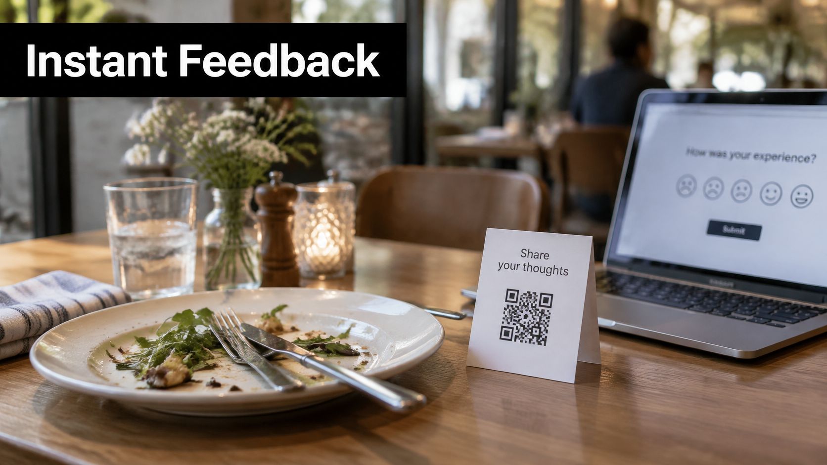
A suggestion card on a restaurant table works because the diner still remembers the dish. A website feedback widget serves the same purpose online: it gives someone a way to explain what happened while the experience is fresh.
Usually, it starts as a small tab or button near a screen corner. The visitor opens it to report a problem, rate a page, or suggest an improvement without navigating away from their task.
The button is only the beginning
A functioning feedback channel has three connected parts:
- The launcher gives visitors a recognizable place to ask for attention.
- The form collects a focused answer, with enough context to interpret it.
- The pipeline delivers that answer to someone who can investigate, respond, or change the site.
Say a customer can find your cancellation page but can't understand when cancellation takes effect. A general satisfaction survey might capture their overall opinion of your service. A page-linked comment can identify the missing explanation.
Broad ratings can hide that distinction. In a study of academic websites, navigation, ease of use, and informativeness each received mean scores of 4.6, while efficiency and interactivity scored 2.9, according to the peer-reviewed study published in Sustainability. Those findings concern academic websites, not a benchmark for your product, but they illustrate why different usability dimensions deserve separate questions.
Use it as a research channel
A widget doesn't replace interviews, usability testing, or analytics. It provides those methods a starting point: a specific page, a reported obstacle, and language your visitors use.
For teams designing a shared destination for suggestions, DOM Studio feedback board blocks offer a reference for organizing visible feedback. Keep private support reports separate from anything you publish, and establish a process for analyzing customer feedback before submissions start arriving.
Start with a decision: Write down the question your widget must answer, such as whether visitors finished what they came to do. If the answer wouldn't change a team decision, reconsider the prompt.
How a Feedback Widget Works From Click to Review
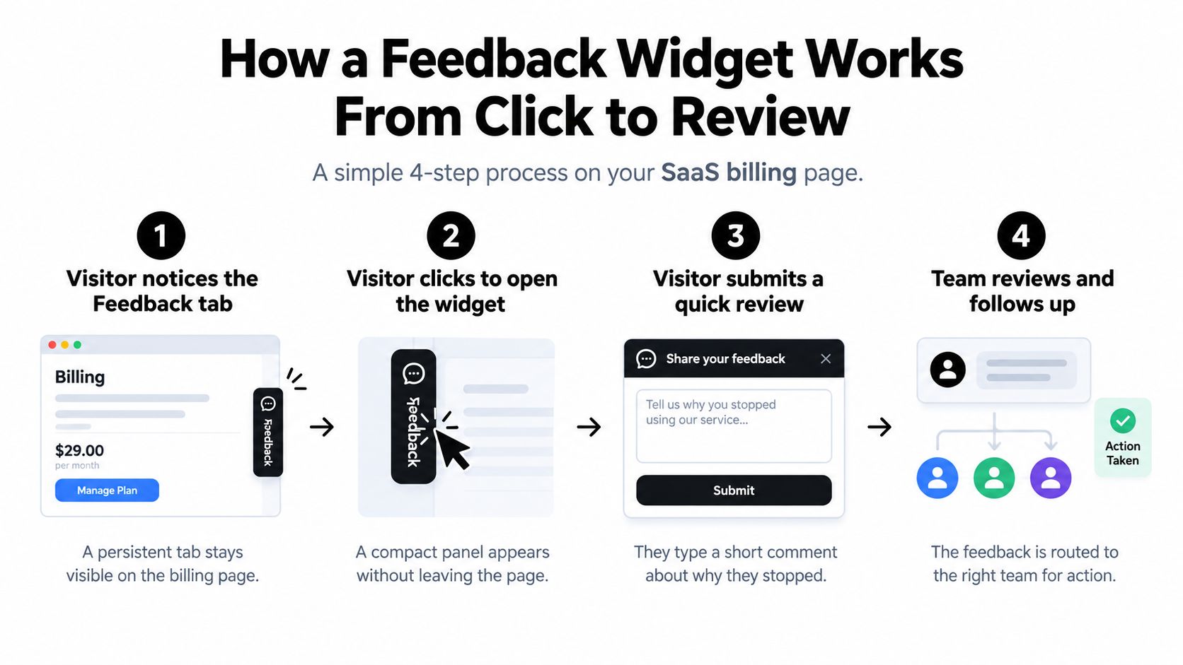
Consider a SaaS billing page where customers leave before paying. Your implementation needs to preserve the customer's task while giving the billing team enough information to investigate.
This process view shows the visitor-to-team handoff.
Configure the handoff, not just the form
-
Make the launcher available. The visitor sees a compact Feedback tab without being forced to open it. The common mistake is placing it where it competes with Pay, hides billing details, or disappears behind another support launcher.
-
Collect a useful first answer. Let the visitor select a category such as Pricing or Error, then offer a page rating if it serves your question. Don't make customers understand your internal department names before they can report a problem.
-
Attach approved context. Include the sanitized page address, browser, viewport, and a safe label for the relevant control when needed. Collecting the last clicked element indiscriminately can capture sensitive content, so use an allowlist rather than recording everything.
-
Offer an optional sentence. A category tells the team where to start; a comment explains what the customer expected. Avoid making a written explanation mandatory when a structured answer already identifies the issue.
-
Route the report to an owner. Send billing problems to the billing queue in Slack or the helpdesk, with a link to the stored report. Don't distribute sensitive report contents across every connected tool, and don't send urgent failures to an unmonitored channel.
-
Review and close the loop. Tag reports by task, issue, and outcome, then review recurring problems on a weekly schedule. Assign an owner to each accepted change and record how the team will verify the result.
Separate investigation from review collection
Private product feedback and public reviews serve different purposes. Tools for automated review requests from BenchKey are relevant when designing a separate post-service review workflow, not as a substitute for investigating a failed payment.
For the billing scenario, suppose comments repeatedly identify an unclear VAT field. The team could clarify its label and validation message, then compare step completion before and after the change while checking for other release effects.
That's an illustrative workflow, not evidence that collecting comments automatically reduces abandonment. The useful outcome is a testable fix, not a larger submission count.
For an additional walkthrough, the following video is available.
Widget Types and Response Rates Compared
Widget types by trigger, response and best use
| Widget type | Trigger | Typical response | Best use | Main risk |
|---|---|---|---|---|
| Persistent corner launcher | Visitor clicks it at any time | 1% to 5%, the passive-widget benchmark reported by Contentsquare in 2025, which also reports 10% to 20% or higher for targeted surveys | General site feedback | Ignored or dismissed by reflex |
| Inline form on help pages | Visitor reaches it while reading | No format-specific benchmark available | Documentation and help article feedback | Adds clutter to content |
| Post-task prompt | Shown after checkout, form submission, or a chatbot answer | Targeted-survey benchmark applies as a broad comparison, not a guaranteed result | Measuring a completed task | Interrupts if shown too early |
| Exit-intent popup | Cursor moves toward leaving the page | 3.65%, the average for all website popups in a SurveyMonkey benchmark reported by Tools8020, not an exit-intent-only measure | Exploring reasons for abandonment | Feels intrusive and can obscure content |
| Full-page modal survey | Timer or page load | No format-specific benchmark available | Rare, explicitly justified research requests | Blocks content and creates abandonment risk |
Read the benchmarks as context
These are channel averages, not universal standards. They don't establish what your audience should achieve, and they don't prove that changing formats alone will improve participation.
The likely practical difference is relevance. Someone who has just finished a support interaction can evaluate that interaction. Someone browsing a homepage may have nothing useful to report yet, even if the feedback tab is highly visible.
Be equally careful with the denominator. A launcher displayed on a page, a survey opened, and a completed response are different events. Track them separately, then define completion rate consistently before comparing pages or releases.
Choose the format from the question
Use a corner launcher when you need an open reporting channel for unexpected problems. It won't tell you what silent visitors think, but it gives motivated visitors somewhere to explain an issue you didn't anticipate.
Use an inline form when the object of feedback is clear, such as a help article. Place it where readers can evaluate the content rather than where it distracts them from reading.
Choose a post-task prompt when you need to understand a completed or attempted activity. Match the question to the outcome: finding an answer, submitting an application, or resolving a support request. Your choice of customer satisfaction metrics should follow that purpose rather than dictate it.
Reserve exit-intent prompts and full-page modals for narrow tests with explicit suppression rules. A cursor moving toward the browser controls isn't proof that someone has abandoned the task, and a desktop exit signal doesn't translate neatly to a phone.
More submissions can mean better timing. They can also mean you interrupted more people. Check task completion alongside feedback participation before calling the change a success.
Placement and Design Rules That Keep Visitors Responding
Start with the live page, not the widget's customization screen. A launcher that looks tidy in isolation can cover a cookie control, mobile navigation, or an error message once everything loads.
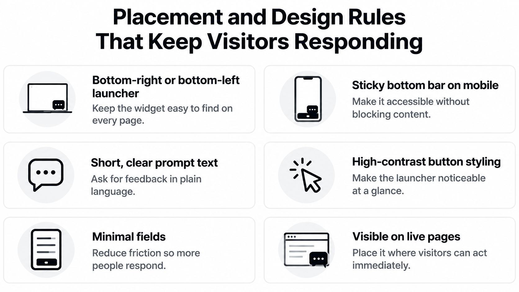
Use this checklist as a layout reference, then test the actual interactions.
Position and interaction
- Choose a clear corner. Try bottom-right or bottom-left placement, then check collisions with chat, consent controls, and sticky navigation.
- Adapt the mobile layout. A bottom bar can work if you reserve space for it. Don't stretch a desktop launcher across content.
- Use an explicit label. Feedback or Report a problem is clearer than an unexplained icon. Keep the close control equally recognizable.
- Leave opening to the visitor. Don't auto-open the feedback form on page load. A reporting channel should be available without demanding attention.
- Preserve the page being reported. A side panel may work on a wide screen, but it still needs testing for obstruction and focus behavior.
In a controlled accessibility study, participants identified overlays and pop-ups as problematic, and the researchers recommended opening the feedback form in a separate browser tab, according to the ACM study of structured accessibility feedback. If you use that approach, tell visitors that a new tab will open and preserve their original page state.
Accessibility and sensitive states
Check more than whether the launcher responds to a mouse.
- Keyboard operation. Visitors must be able to reach, open, complete, and close the form without pointer input. Restore focus to a sensible place when they return.
- Visible focus and labels. Keep a visible focus indicator, associate labels with fields, and announce submission errors in text.
- Readable presentation. Test contrast, zoom, text resizing, and narrow layouts. Don't use color alone to communicate a failed submission.
- Sensitive-task suppression. Hide intrusive prompts during payment entry, password changes, and authentication challenges. Keep a separate route to help available.
- Purposeful metadata. Attach only context needed to reproduce the issue, with an explanation visitors can understand.
Use customer journey mapping to identify where the launcher helps and where it competes with the task. Test representative help, account, billing, and error pages on desktop and mobile, using a keyboard and a screen reader.
A successful test includes dismissing the form, recovering from validation errors, and returning to the original task. Opening the widget is only the beginning.
How Many Questions and When to Trigger Them
An analysis of more than 4,300 surveys reported a 15.97% median response rate for surveys containing two to three questions, compared with 6.87% for those containing seven or more, according to Marker.io's website feedback guide. That association supports keeping forms short, but it doesn't isolate question count from audience, timing, or survey purpose.
Every additional required answer asks the visitor to do more work. The right question earns its place by changing what your team does next.
Build a conditional path
Start with a high-signal prompt appropriate to the task:
- Task success. Ask whether the visitor could finish what they came to do.
- Answer usefulness. Ask whether the help article or support response answered their question.
- Issue category. Ask what kind of problem occurred when routing is the immediate priority.
Reveal a free-text field when someone signals a problem, but keep it optional. If a follow-up won't affect routing, diagnosis, or prioritization, remove it from the required path.
For effort-focused journeys, use a consistent question design so your customer effort score remains interpretable. Don't mix ease, satisfaction, and answer accuracy into a single question.
Trigger on a meaningful event
A failed search, displayed error, completed support exchange, or handoff to a human provides a reason to ask. A long stay on an article is less decisive: someone may be reading carefully rather than struggling.
Apply a frequency cap that fits the interaction cycle. Suppress repeat invitations after dismissal, avoid prompting first-time visitors before they've attempted anything, and exclude sensitive administrative workflows.
Neutral wording matters as much as timing. UserTesting's guidance on gathering meaningful insights warns that wording can bias responses and that required forms during tasks may produce less useful feedback because users are concentrating on the task.
Interpret the sample, not just the score: People who respond aren't automatically representative of everyone who visited.
Segment results by page, task state, device, customer type, and outcome. Compare chatbot users with non-users only when their tasks and customer mix are comparable; people seeking support may already be experiencing more difficulty.
Also inspect where you hear nothing. If mobile visitors abandon a form but rarely submit feedback, more desktop comments won't fill that gap. Test the mobile workflow directly, and cut any required question that doesn't change the next action.
What Data to Capture and Where Accessibility Limits Start
A feedback widget can help someone report an accessibility barrier. It doesn't repair that barrier or establish that your website is accessible.
The FTC complaint against accessiBe describes accessibility overlays as temporary interface modifications rather than permanent fixes to underlying website code. Keep the jobs separate: the widget collects input, while developers repair the site's markup, interaction behavior, content, and other underlying problems.
Give every field a purpose
Data fields a feedback widget may capture
| Field | Purpose | Handling |
|---|---|---|
| Page URL | Locates the issue | Collect the relevant path; remove tokens and sensitive query parameters |
| Browser and viewport | Reproduces layout bugs | Collect only technical details needed for diagnosis; avoid unnecessary fingerprinting |
| Triggering element | Pinpoints the control that failed | Collect a safe label or identifier, not field values or surrounding page content |
| Email address | Lets the team reply | Make optional and explain why it's requested |
| Screenshot | Shows the bug visually | Offer blur, preview, and removal before sending; exclude sensitive fields |
| Disability or health details | Adds accessibility context | Never require; accept only information the visitor chooses to volunteer |
An authenticated page address can contain an account identifier. A screenshot can reveal an invoice, message, or another person's information. Browser details aren't a reason to label an entire report anonymous when other fields identify the visitor.
Use an allowlist for automatic collection. Describe the permitted fields, exclude passwords and payment values, and test what reaches your storage and integrations.
Make privacy choices usable
Place a concise collection notice beside the submit control and link to the full privacy notice. Explain whether the team will reply, where attachments go, and how visitors can contact someone without completing the form.
For our workspace customers, customers decide what content they submit and how their agents collect visitor information. They're responsible for providing any additional notices and obtaining any consent their use case requires.
Don't require disability-related disclosure to report an inaccessible control. A visitor should be able to describe what failed without explaining a diagnosis or proving that they need assistance.
For a separate usability evaluation, Digital Skyrocket's guidance can help teams find friction in service website forms. Use that kind of task-based inspection to investigate the underlying form, rather than treating another widget as the repair.
Keep the default collection restrained: no unnecessary cookies, no unrelated behavioral tracking, and no automatic screenshots of sensitive pages. Offer a human escalation path for people who can't use the widget itself, and make sure someone owns that channel.
Choose Your Widget and Launch With Confidence
Choose a widget only when it passes every criterion below. Treat a red flag as a reason to pause deployment until it's resolved, not as something a polished demo can outweigh.
Criteria for choosing a feedback widget
| Criterion | What to Check | Red Flag |
|---|---|---|
| Accessibility support | Keyboard access, screen-reader labels, contrast, error handling | Promises full compliance from an overlay alone |
| Data handling | Storage location, retention, deletion, consent options | No clear data processing terms |
| Trigger rules | Targeting by page, task, and frequency | Only a global auto-open on every page |
| Routing | Negative feedback sent to a named owner | Everything lands in an unmonitored inbox |
| Integrations | Connections to Slack, Zendesk, Notion, or the team's helpdesk | No usable handoff into existing workflows |
| Performance | Script size and effect on loading and interaction | Third-party scripts noticeably slow the page |
Launch a bounded pilot
Write the decision question before installing anything. Pick the format that matches it, draft the first prompt, and remove follow-ups that don't affect the team's response.
Then configure triggers and exclusions, test the complete interaction, and assign a review owner. Keep a record of the configuration so a later change in participation doesn't become a mystery.
For teams adding a support channel, we provide an embeddable Ask AI widget that handles most support queries, with chat agents that answer visitor questions and can hand conversations off to a human. Our widget installation guide explains the setup; evaluate support resolution separately from the success of your feedback collection.
Review decisions, not submission totals
Your launch review should answer practical questions:
- Participation quality. Are reports tied to identifiable tasks, or are you receiving context-free ratings?
- Coverage. Are relevant devices, customer groups, and unsuccessful outcomes represented?
- Operational follow-through. Did an owner investigate the reports and record a decision?
- Visitor impact. Did the prompt interfere with the task it was meant to improve?
- Fix verification. Can the team test whether a change addressed the reported obstacle?
Use the format benchmarks as directional context, not a pass mark. A sufficient response rate is one that supports the decision at hand without hiding important gaps in who responded.
Set a review date before launch. Keep, revise, or remove the widget based on what the team can act on and whether visitors can still complete their work.
SupportGPT offers embedded AI support agents that answer visitor questions and hand conversations to a human when needed. Visit SupportGPT to set up an Ask AI widget, then test it alongside a focused feedback prompt so your team can distinguish answered questions from unresolved tasks.